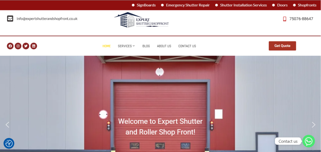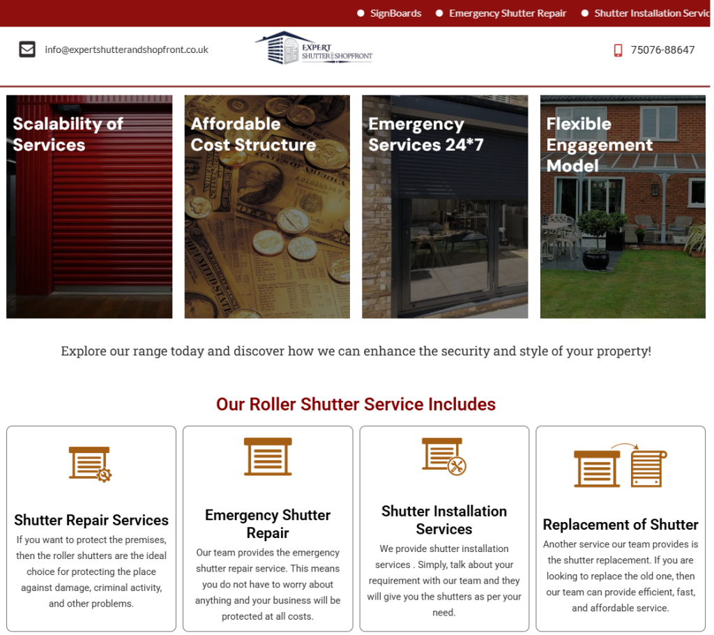
Clearly communicates services and technical expertise
Builds immediate trust with commercial clients
Maintains a clean, professional, and authoritative tone
Allows visitors to understand offerings quickly and take action
Works seamlessly across devices for on-site and office users

Function-First Design: We adopted a structured layout that prioritises information hierarchy — allowing users to instantly understand services, applications, and value propositions.
Professional Visual Language: A strong, neutral colour palette, balanced spacing, and bold typography were used to reflect the brand’s reliability and industrial expertise.
Clear User Pathways: Each section was designed to guide visitors logically, from service discovery to enquiry, without distractions or visual noise.


